A Tale of Two Rebrands: GM and Burger King.
What’s the first thing customers notice about you?
I’ll tell you—it’s your brand. So if you decide to change your most recognizable asset, you shouldn’t do it lightly.
One reason that businesses decide to rebrand is to respond to internal and external pressures in the marketplace and reposition to attract and retain audiences. The two recent rebrands of GM and Burger King are no exception. Both GM and Burger King are established brands that rebranded as part of a wider rethinking of the business and its positioning. And the success or failure of these rebrands will likely have broad implications for their futures.
In this post, we take a closer look at these two rebranding efforts and examine the factors that work in their favor.
But first, let’s take a look at what makes a rebrand successful.
What makes a winning rebrand?
There’s no step-by-step process to guarantee your next rebrand is a success, but there are a few guidelines that all successful rebrands follow. In our post How to Create a Brand Identity That Wows, we discuss several factors that affect the success of a new identity.
Here’s a recap of the main points, but make sure to check out the blog post:
1. Offering Audience Appeal: Does the new identity appeal to its target audience?
Whenever you develop a new brand identity, you must consider your target audience first. Your audience needs to be able to easily recognize the new design and differentiate your brand from the competition. When you redesign your identity, you have two decisive options: evolutionary or revolutionary. In evolutionary rebranding, you want to make sure to keep enough of the same elements so that it still “looks like” your brand. This will ensure your new look retains the brand equity your company has earned over the years.
In revolutionary rebranding, you rebuild the identity from the ground-up. This signals to the market that you are shattering the mold and this is the new you. This approach is very helpful in attracting new audiences and new markets while eclipsing any new competitors in your category. But it does require extra effort to make it successful.
2. Developing a Cohesive and Flexible Design: Is the new identity integrated and adaptable?
Your new brand assets need to work together to create a unified whole. All of the elements of design, including iconography, color and typography, must jointly communicate the business’ core values. Plus, your design needs to be flexible enough to work in multiple environments. It is especially important that your design displays well in digital and mobile formats. A responsive web version of your identity is critical to your success online.
3. Humanizing Your Brand Message: Does the new identity help you tell your unique story in a way that connects?
Your new identity is a visual representation of your brand essence. It needs to symbolize your culture and heritage, illustrate the values you believe in and make a lasting impression. It needs to tell your unique story and be human. Most importantly, it needs to clearly communicate these messages to current and future audiences as you grow.
It’s not easy to bring these elements together, but when it happens, it’s pure magic. Check out our recent rebrand of the Cast Iron Soil Pipe Institute (CISPI). Also, here’s how we at Agency McKenna rebranded to create continuity with our former logos and also appeal to future audiences.

GM is a car manufacturer long known for the quality, value, durability and safety of its vehicles. In recent years, however, the company has felt considerable competitive pressure from electric car manufacturers. The company has lost market share as its target audience has become increasingly aware of the environmental effects of gasoline-powered vehicles and has aggressively shifted toward electric cars. Also, technical advances have improved the design and reliability of electric vehicles, making them a more appealing purchase option. To maintain its position in the evolving marketplace, GM recently embarked on an ambitious initiative to augment its fleet of electric vehicles.
Its new brand identity was launched as part of a larger campaign, “everybody in.” Designed to promote its line of Ultium electric vehicles, the campaign highlights GM’s determination to lead in the electric car space and invites others to join in its effort to “create a world with zero crashes, zero emissions and zero congestion.”
GM also announced its plans to phase out all vehicles using internal combustion engines (ICE engines) and go all-electric by 2035. Wow…that’s a value statement.
What GM says about its brand:
From the press release:
“[The new] revitalized brand identity [is] designed for a digital-first environment. The new logo builds on a strong heritage while bringing a more modern and vibrant look to GM’s familiar blue square… The team of GM designers tasked with creating the new logo considered how to balance the history and trust inherent to the existing design with GM’s vision for the future…
The new GM logo features a color gradient of vibrant blue tones, evoking the clean skies of a zero-emissions future and the energy of the Ultium platform. The rounded edges and lower-case font create a more modern, inclusive feel. The underline of the “m” connects to the previous GM logos as well as visually representing the Ultium platform. And within the negative space of the “m” is a nod to the shape of an electrical plug.”
Our take
GM is treading a fine line between a rebrand and a completely new brand. If you study this logo, you can tell there are some aspects that are the same—but it’s hard to identify this as the old GM brand at a glance. But maybe that’s the point. GM needed to think new and future-focused, and this new look takes the revolutionary approach to rebranding.
Many of the core design elements have been “modernized.” The “GM” letters are now lowercase in a new font, the solid blue square is gone and now replaced with a blue rounded outline, the underline that used to be under the GM has been shortened and the color is more electric (pun intended). So, they’ve changed elements of the shape, the color, the layout and the typography—dramatically and all at once. And, honestly, we didn’t see the implicit “electric plug” in the negative space of the “m” at first. But now we can’t unsee it, which is a good thing.
There’s also the question of how flexible this new design is. We think this logo will work well in digital formats. One thing we did notice is that the logo, which depends heavily on whitespace, may have difficulties displaying on backgrounds other than white.
All of these design decisions directly impact the audience appeal and human qualities of GM’s brand message. The new look is definitely revolutionary and may be too “different” for legacy audiences to connect it with the “new” electric vehicle EV-focused GM brand. The previous logo had been around for more than 50 years (since 1964) and people have grown to associate it with GM’s dedication to quality, safety and value. Making such drastic changes to the brand risks endangering its loyal base. But it does signal GM’s aggressive goal to put “every driver in an electric vehicle on a scale previously unseen and bring the world to an all-electric future.”
This new identity has some work ahead of it to deliver on that promise. And we applaud GM for taking on this ambitious plan, starting with its new GM logo with everybody in.
Burger King: Big, Bold and Back to Its Roots.
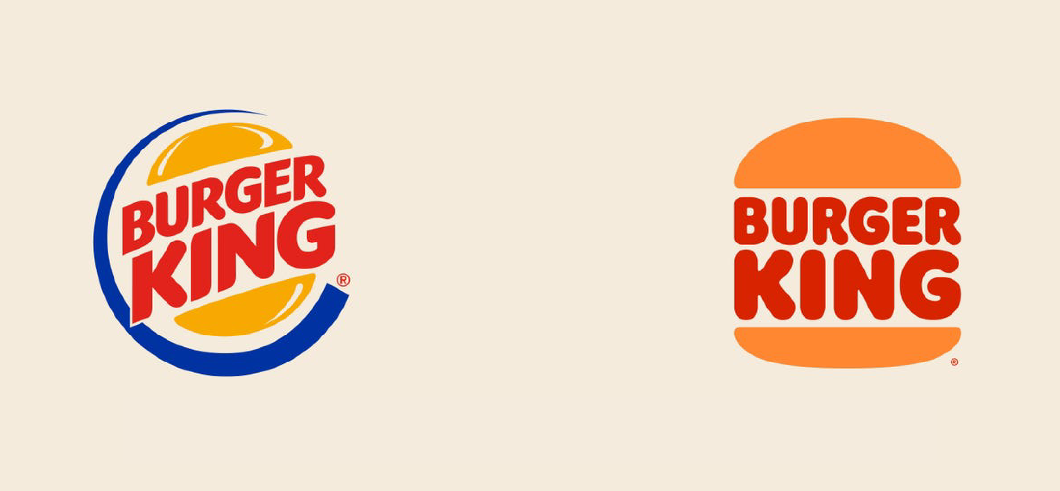
Founded in 1954, Burger King has long been a leader amongst quick-service restaurants, or QSRs. In recent years, however, the company has felt increased pressure to adapt to new attitudes and preferences in the marketplace. As consumers have become more health-conscious and environmentally aware, they have begun to scrutinize the quality, freshness and environmental impact of the foods they consume.
In addition, the advent of the millennial consumer has compelled businesses to rethink the way they have traditionally done business. Burger King’s new logo and identity are part of a much larger effort to update the company’s packaging, restaurant merchandise, menu boards, crew uniforms, restaurant signage and decor, social media and digital and marketing assets.
What Burger King says about its brand:
From the press release:
“The [new brand] announcement signals a commitment to digital-first expression and recent improvements to taste and food quality, through the removal of colors, flavors and preservatives from artificial sources from menu items, as well as an ambitious pledge to environmental sustainability…
Today, more than ever, Burger King strives to ensure guests feel good about its food, and this is reflected throughout the visual design, restaurant design and across the entire digital experience…
Dialing up taste and quality through design, every design element was intentionally reimagined to better reflect the new Burger King food journey. The design principles capture the unique characteristics of the Burger King brand: Mouthwatering, Big & Bold, Playfully Irreverent and Proudly True.”
Our take
This is some tasty design. There’s so much about this that works. Let’s dig in. Please pass the ketchup.
This new identity makes some modest changes that have a big impact. The new logo returns to the look and feel of the company’s older, simpler designs by “straightening out” the burger and removing the blue “swoosh” so common in the first decade of 2000. The typography has been updated to a new “bubble” font, but the lettering retains the general look and scale of the old logo. The colors are more “retro” and feels like Burger King is getting back to its roots. The part of the logo that resembles a bun actually looks like a bun. The identity is updated, but it’s still recognizable as Burger King.
From a design perspective, the “chunkiness” of the logo is perfect for digital. Even when scaled down significantly, the colors and shape of the logo are easily distinguishable. The thickness helps to punctuate headlines. And the removal of the “swoosh” in the previous design gives the design more room to breathe in smaller formats. What’s clear is that the brand has moved away from signage as its main identity channel to digital—social, web, mobile app. A Whopper of an idea!
But what’s even more remarkable is how well the identity highlights the company’s authenticity and humanity. Burger King set out to create a new brand that was fresh and offbeat, and it certainly is on its way. The focus is clearly on the main product—the burger. The new, bold design emphasizes quality, wholesome ingredients and delivering on the quick-serve promise—quality and speed. The old “swoosh” felt manufactured, artificial and a little “plastic,” similar in feel to the Taco Bell logo. The new, ever-so-slightly modified color palette feels earthy and natural. The addition of playful typography and fun illustrations make consumers crave their food.
Finally, Burger King proves that it is clearly in touch with its humanity. The whole feel of the new brand, with its slightly ’70s vibe, conveys a strong sense of nostalgia. It hearkens back to its history, its long-standing relationship with consumers and their fond memories of its flame-broiled food. This is the same fun brand that we’ve grown to know and love. But now, it’s been refreshed for a new generation of eaters.
Well done, Burger King. You’ve retained your crown.
As you can see, a lot of things have to come together to pull off a successful rebrand. You’ve got to make sure your new design appeals to your audience. The design has to display well in a variety of contexts, especially digital. And you must make sure to retain the human essence of your brand. A lot is riding on the success of your rebrand, so you need to invest the necessary time, energy and resources for everything to work.
But when you get it right, you’ll have a valuable asset that will help you achieve your larger business objectives. A great brand will serve your company well into the future: attracting and keeping customers for life.

Elizabeth McKenna, CAE
Principal & Managing Partner
SAY HELLO.
Is your brand lacking luster and weighing your business down? Free your brand and fly toward your future. The questions is—will your new brand be evolutionary or revolutionary? Whichever you choose, your rebrand needs to get it right for your customers and for the long road ahead.
Let us give your brand the power it needs to achieve your business goals and your best future. We’re here to help!
Disclaimer: This blog is for educational purposes. Under Fair Use and Freedom of Expression of U.S Copyright Law, we may use images, video, and other media to provide comments, news reporting, scholarship, teaching and research. Registered trademarks and copywritten material are individually owned and do not imply an endorsement.

