How to Create a Brand Identity That Wows.
Imagine you’re walking through the grocery store, and all the logos on the products have disappeared. How do you find your favorite cereal? Can you recognize your favorite coffee from the generic store brand? Do you actually know what you’re buying?
Even though they might not get a lot of notice, brand identity and logos are all around us. They provide helpful cues that guide us through our daily lives. Seeing a recognizable logo gives us a feeling of comfort, trust and familiarity while an unusual, eye-catching logo can lead us to try something new. Logos are more powerful than many people think.
Why Logos Matter
You might not realize it, but there’s a lot more to a logo than just a picture and text. A logo is the symbolic representation of your business. It needs to be immediately recognizable, yet flexible enough to work in a variety of environments. And, most of all, it has to encompass everything you do, embody your history and resonate with your audience—both now and into the future.
A future-focused logo can help you:
• Attract new customers and keep loyal ones
• Differentiate your brand, products and services
• Help people decide to buy and generate loyalty
• Attract top talent who become brand ambassadors
• Create an intangible halo of value around your brand
As tempting as it may be, you really shouldn’t design your logo in-house. Because your logo is so important and expertise is needed to do it well, you owe it to your company to hire a professional design team. Once you’ve got your logo, you’ll find it’s well worth the investment. An effective logo will serve you for many years to come so doing it right is paramount.
Logo Design Checklist
So, now that you understand the basics of logos and why they’re important, you’re probably wondering whether your logo “checks all the boxes.” Here’s a handy guide to help you determine whether you’ve got a great logo, or whether you need a brand refresh or brand overhaul.
1. Is your logo based on thorough research?
This is probably one of the biggest issues we see with logos—they’re based on leadership vision from the past or personal preferences, not research. Your logo isn’t a reflection of you—it should be tailored to your audiences, support your constituents and everyone you work with. It needs to connect with them and be appealing to new audiences and prospects. To make sure your logo is on target with your audiences, you should conduct a brand audit, competitive analysis and stakeholder interviews. Aligning these insights can help you determine what elements to emphasize or adjust.
You also need to be aware of how your logo will be perceived in your industry. Does it stand out from your competitors, or is there a possibility for confusion? You absolutely want something that is distinctive, but be aware of your industry’s environment. A logo that is too bland will give your audience the wrong impression. And while it’s certainly possible to create a logo that is dramatically different from your peers, a logo that is “too” different may be a turnoff to your audience.
Whichever route you take, you absolutely need to justify your logo’s strategic direction with data and make sure that your final logo aligns with your brand values and brand essence.

2. Does your logo convey a brand message?
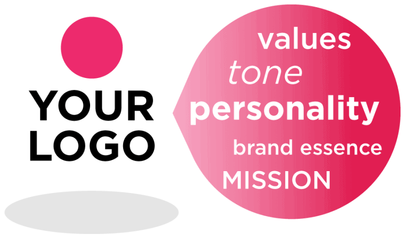
When your audience thinks of your business, what lasting impression do you want to make? What is your personality? What values do you believe in? What kind of culture and heritage do you have? Now reflect on your logo. How well does it communicate these messages? Does it reflect the way you want to be perceived?
Again, this is based on research. As you define the way you want to be positioned, review the current assets in your brand architecture and rate the success of these assets with a brand scorecard. Look at your analysis to uncover which messages resonate with your audience and what qualities they’re looking for. Then, convey these messages to your audience visually, using your logo.
3. Is your logo visually distinctive?
You want your logo to make a strong visual impression, so pay attention to design principles and best practices. The elements you incorporate in your design will have a strong influence over how it is perceived. To create an effective logo, the whole is greater than the sum of its parts and include:
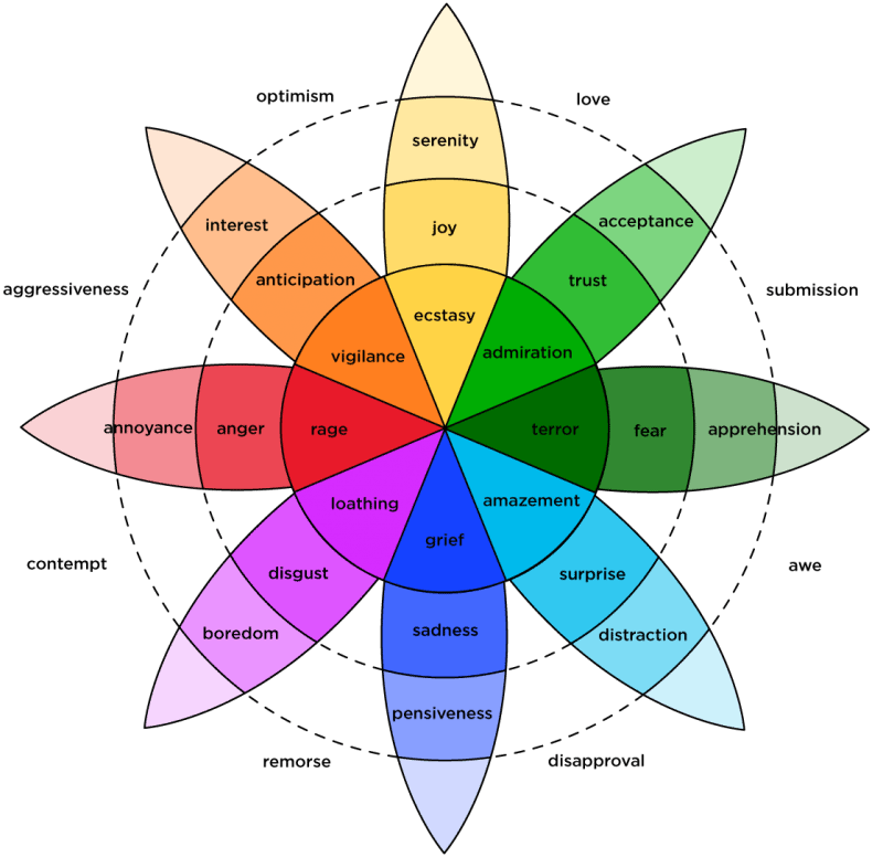
Robert Plutchik’s “Wheel of Emotions”
Color That Defines You.
You’ve probably noticed how the right combination of colors just “pop” and create emotions. Check out our blog on “How to Make a Brand People Love” for color theory at work. Certain colors go together based on their relationship in the color wheel. Consider using analogous colors for a unified look, or complementary colors for more contrast. Work to create the color harmonies in your logo.
Colors also have different meanings and energies. For example, if you want to create a soothing theme, consider using shades of blues, browns and greens. Alternatively, if you want to create something more eye-catching and dramatic, consider using reds, tints of orange and yellow. Also be aware that colors have different meanings in other cultures and around the globe. If you’ve got an international business, you’ll want to make sure the colors you choose work well in all of your locations. Again, research can identify colors appropriate for your brand.
The key to using color effectively is to find a balance. Here again, a good design team can help provide you with options and impacts.

Negative Space Drives a Message.
Have you ever noticed the implicit arrow in the FedEx logo? Or the m and b to create a baseball glove for the Milwaukee Brewers? Or the peacock created among the feathers in NBC’s logo? If you have, you understand how effective negative space can be. (And if you hadn’t noticed before, you’ll never be able to unsee it!) Incorporating negative space in your logo designs can add an extra meaning that gets your logo recognized and provides visual impact on your brand message.
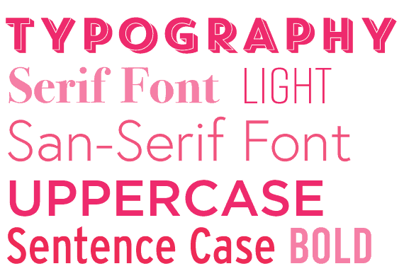
Typography Creates Personality.
Typography conveys a lot about your business, so choose your type wisely. If your goal is to communicate professionalism, it’s hard to do when your font is Comic Sans. Or if you’re trying to attract a fun, whimsical audience, Times New Roman probably isn’t the best choice. There are a lot of aspects to consider when choosing your type. Do you use a serif or sans-serif font? Uppercase or sentence-case? Think about the tone you want to convey and use typography to help tell that story.
Additionally, select a type that is easy to read and easy to use. Cursive and italic fonts can be difficult for people to read, so use these types sparingly and with purpose.
The ultimate test of how visually appealing your logo is will be determined in the marketplace. To give your logo the best chance of success, make sure to get lots of feedback from your target audiences both internally and externally.
4. Is your logo flexible and responsive for mobile devices?
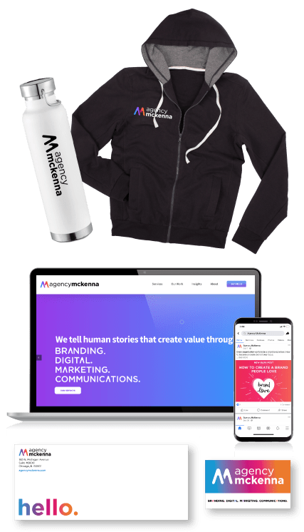
Think of all the places your logo exists. Conducting a communications audit can help you take inventory of all of your brand assets, communication vehicles and brand performance. Your logo leads your website, your business cards and stationery to say “hello.” It might be printed in brochures and shipping boxes. And maybe printed on coffee mugs, water bottles and pens. Perhaps it’s even printed on t-shirts, magnets and coasters. Or even the side of your building! Whether it’s in the vestibule of your location, a shirt pocket or vest—your logo has to be flexible and future-focused. From digital, to print to fabric and metal, your logo has got to convey the might of your brand and look good everywhere.
Consider all of the possible ways your logo can show up and make sure it works in each environment. You should think about the future, too. Maybe you don’t need to print your logo on merchandise today, but you may in the future as your business needs change. A logo that’s clean and sharp with fewer colors may give you the most options.
5. Is your logo presentation consistent?
If you’ve got several different sub-brands , you’ll want to ensure the logos for each of them work together as a cohesive whole. Think of your business as a branded house. Your main logo and sub-brand logos have to look connected. One solution is to have them in a lock-up or stacked. For Illinois Action for Children, another solution is to use the same design for all your sub-brand logos, with changing colors or business units to extend the brand into departments or key areas of your business. Regardless of a branded house or a house of brand, all of your logos need to be clearly related yet stand on their own individually.
Creating a family of logos is a lot more involved than creating a single logo. Consider all of the factors in this checklist for each logo.
6. Does your logo tell your story that’s unique?
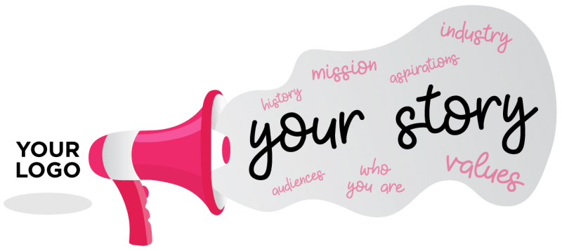
One of the more difficult challenges in a branding overhaul is telling your story through your logo. Your logo needs to tell who you are, your values and your mission. It needs to represent your workforce and resonate with your wider community. It needs to evoke the feelings you want to communicate to your audience—both now and in the future.
Things get even more complicated with a brand refresh. If you already have developed a lot of brand equity with your existing logo, it might not be a good idea to shake things up completely. But it may still need to be updated for new audiences, new sales geographies, new product or service lines, etc. In this case, you’ll need a logo that maintains the core elements of your old logo, but puts a new spin on them. Your refreshed logo should be attractive to new markets, yet still recognizable as the business your existing customers, staff and other audiences have grown to love.
Creating a successful logo is not a simple endeavor. It requires the rigor of research, the definition of message and the balancing of priorities. When was the last time you refreshed your brand? Is your current logo serving the goals and objectives your leadership desires?
If you need help creating a remarkable logo for your business, let us help! Our goal is to refresh or overhaul a logo so it builds more brand equity and ROI for years to come.
Share This Story, Choose Your Platform!
Disclaimer: This blog is for educational purposes. Under Fair Use and Freedom of Expression of U.S Copyright Law, we may use images, video, and other media to provide comments, news reporting, scholarship, teaching and research. Registered trademarks and copywritten material are individually owned and do not imply an endorsement.
